We don’t usually get excited about a movie poster anymore, and that’s kind of the problem.
For a lot of modern sci-fi and superhero releases, the one-sheet has turned into the same visual soup: floating heads, muddy lighting, lots of expensive faces, and just enough clutter to tell us the legal department probably got notes in early. Then a poster like Supergirl lands, and suddenly we remember what this stuff can do when someone has an actual idea.
The new image for DC’s Supergirl works because it isn’t trying to show us everything. It’s trying to tell us what kind of movie attitude it wants to sell, and that used to be the whole point.
Why the Supergirl poster clicks
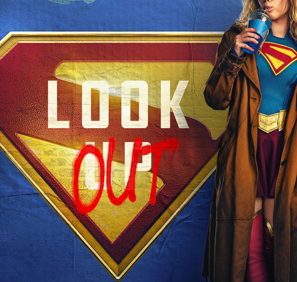
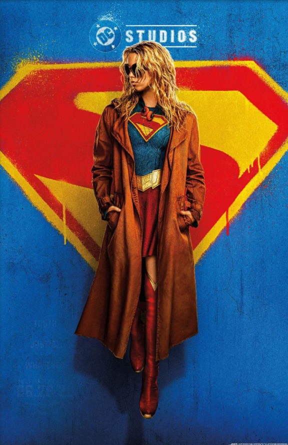
The core design is simple enough that we can read it in a second. Milly Alcock stands in front of a spray-painted House of El symbol, wearing an overcoat, sunglasses, and headphones, with the tagline “Truth. Justice. Whatever.” That combination does a lot of work fast.
We get the connection to Superman without the poster needing to over-explain itself. We get a version of Kara Zor-El that feels younger, sharper, and less interested in carrying herself like a polished symbol. And we get a visual identity that is legible from a distance, which sounds basic, but apparently has become a lost art in the blockbuster era.
That clarity matters. A poster is not a wiki page. It does not need to summarize the cast list, the third-act battle, and every contractual billing obligation in a single frame. It needs to catch our eye and stick in our head. Supergirl does that.
The modern blockbuster poster problem
We’ve all seen the formula. Hero in the middle. Supporting cast arranged around them. Villain looming somewhere in the fog. Orange-blue grading if somebody felt adventurous, gray-brown sludge if they didn’t. Maybe a beam in the sky if the designer really wanted to live dangerously.
Sci-fi has been hit especially hard by this. The genre should be a playground for bold visual ideas, but too many studio posters now feel assembled rather than designed. They often read like compromise documents, not pieces of visual storytelling.
That’s probably not an accident. Big franchise marketing has to satisfy a lot of people at once, and posters can end up reflecting billing hierarchies, brand consistency, and international campaign needs more than artistic intent. We can’t always prove the exact internal process from the outside, so we should be careful there. But the results often look like committee work, and our eyes usually know it before our brain finishes the thought.
That’s what makes a poster like Supergirl feel refreshing. It’s specific. It picks a lane. It trusts mood over inventory.
Science fiction used to be much bolder with poster art
If we zoom out, sci-fi has a long history of selling itself through strong poster concepts. In the 1950s, genre advertising was loud, pulpy, and often gloriously unconcerned with accuracy. Giant monsters got bigger, robots got meaner, and subtlety was left at the curb. The point was to promise sensation.
That era gave us posters for films like The Day the Earth Stood Still and Forbidden Planet that were memorable even when they were only loosely connected to what was actually on screen. As advertising, they worked because they knew exactly what emotional button they were trying to press.
By the late 1960s and early 1970s, some sci-fi posters shifted toward a colder, more hardware-focused look. 2001: A Space Odyssey and Silent Running leaned into imagery that felt closer to serious speculative fiction cover art than carnival-barker pulp. Different tone, same principle: the image had a point of view.
The late-1970s blueprint still matters
If we’re being honest, a lot of modern poster language still lives in the shadow of Star Wars and Alien.
Early Star Wars posters absolutely used collage, but they did it with real composition and energy. Tom Jung’s famous early design is not remotely screen-accurate in every detail, yet it sells scale, myth, romance, and danger in one hit. Tom Chantrell’s poster pushes that even further, turning the cast and iconography into a kinetic burst rather than a stack of headshots.
Then Alien went the other direction and proved how powerful a single idea could be. The cracked egg suspended in darkness, paired with “In space no one can hear you scream,” remains one of the cleanest examples of concept-driven movie advertising ever made. We know almost nothing from the image, and we know exactly how we’re supposed to feel.
That split still defines the best sci-fi posters now:
- The collage approach, where character and action are arranged with real style and movement.
- The concept approach, where one image carries the entire emotional pitch.
The weaker modern posters often fail because they don’t fully commit to either.
The artists who made posters feel like events
We also can’t talk about this history without talking about Drew Struzan, whose hand-painted work became the gold standard for a certain kind of blockbuster poster. His art for Blade Runner, the Star Wars prequels and Special Editions, and Indiana Jones and the Last Crusade helped define how these movies lived in our heads before we even bought a ticket.
Struzan once summed up the goal neatly when he said he wanted the poster to “look like an adventure.” That’s the whole job, really. Not to function as a spreadsheet of recognizability, but to promise an experience.
His poster for The Thing is another perfect case. A faceless figure in a parka with light exploding from where a human face should be. That image gives us mystery, dread, and isolation instantly. No clutter needed. No franchise-logo overkill. Just an idea, executed well.
Some posters still get it right
None of this means every modern poster is bad. There are still strong exceptions, and it’s worth saying that clearly so we don’t slide into old-man-yells-at-multiplex mode.
Recent genre campaigns like Arrival and Alien: Romulus have shown that studios can still back images with restraint and atmosphere. Contemporary poster artists such as Matt Ferguson have also kept the tradition of bold, collectible genre art alive, especially through alternative and commemorative work.
But that’s also part of the frustration. We know the craft hasn’t vanished. The industry still has talented designers and illustrators. The issue is that the official mainstream one-sheet too often settles for recognizability over impact.
What Supergirl gets right, at a glance
Here’s the short version of why this poster stands above so many peers:
- Strong silhouette: the central figure reads clearly and immediately.
- Clear iconography: the House of El symbol does the franchise work without clutter.
- Character attitude: wardrobe, pose, and styling tell us who this Kara might be.
- Memorable tagline: “Truth. Justice. Whatever.” gives the whole image a point of tension.
- Color contrast: bold primary tones help it pop instead of sinking into grayscale mush.
That may sound obvious, but obvious is exactly what too many bad posters forget. If we can’t process the concept in a few seconds while walking past it, the design is already losing.
A quick comparison
| Poster trait | Many modern franchise posters | Supergirl poster |
|---|---|---|
| Visual focus | Split across a large ensemble | Centered on one character and one idea |
| Color use | Often dark, muddy, or over-graded | Bold, readable, high-contrast |
| Story signal | General scale and spectacle | Specific attitude and tone |
| Memorability | Blends into the franchise wall | Feels distinct at a glance |
| Design philosophy | Coverage and brand management | Concept-first visual statement |
Why this matters beyond one movie
We can shrug and say posters don’t matter much in the trailer-and-social era, and there’s probably some truth in that. Marketing campaigns live across clips, memes, motion graphics, convention reveals, and cast interviews now. A one-sheet is no longer the entire storefront.
But posters still matter because they compress a movie’s identity into a single frame. When they work, they become part of the film’s legacy. We remember the best ones for decades because they don’t just advertise a release date. They create an image the movie has to live up to.
That’s why the Supergirl poster has sparked this reaction. It reminds us that even now, with every franchise temptation pushing toward sameness, a studio can still put out something sharp, legible, and a little cheeky. Something that looks designed, not merely assembled.
We should ask for more of this
Whether Supergirl turns out great, mediocre, or a complete argument-generator in the group chat, the poster has already done one thing right. It made us stop and actually look.
That shouldn’t feel rare in sci-fi, of all genres. This is the space of impossible worlds, iconic symbols, unnerving concepts, and giant emotions. We should be getting poster art that reflects that. Not every time, sure. But a lot more often than we do now.
So yes, we should give Supergirl its flowers here. Not because a good poster guarantees a good movie, because we all know better than that, but because it shows the old craft is still available if anyone in the room is willing to trust it.